Moloch has now been published in TUGboat (Larsson and samcarter 2026)! The article will be available for free on the TUGboat website when the next issue is published.
My beamer configuration for presentations has been in a state of flux for as long as I can remember. I have tried many different themes and configurations, and have typically tried to keep the theme minimalisic but at the same time functional and visually appealing. Nevertheless, I have frequently found myself scrapping my custom modifications and returning to the Metropolis theme, which I think is the most well-designed theme that I have so far encountered for beamer.
The only problem is that Metropolis is no longer actively maintained. The latest update (at the time of writing) was six years ago and since then a number of issues have cropped up. Most of them are not major and can be circumvented through various hacks and workarounds, but I have grown increasingly frustrated with the separate file of Metropolis patches that I’ve had to keep around to fix these issues. Beamer itself in fact even includes several patches now in order to stop the theme from breaking (see here, here, and here.)
Moloch
This has now (since some months back actually) led me to fork Metropolis to try to fix these outstanding issues. I call the new theme Moloch (which is likely familiar to you if you know your Metropolis). The original design is still pretty much intact save for a few tweaks that I will summarize in Section 3, which overall bring the theme closer to normal beamer behavior. The code for the theme has also been simplified and made more robust. Metropolis, for instance, made much use of \patchcmd from the etoolbox package to patch beamer theme internals in order to support modifications to, for instance, frame titles. This was what lead the theme to break in the first place as beamer introduced changes in these commands and I have thus opted to remove all this kind of patching in favor of relying on standard functionality from the beamer theme instead.
In fact, it is now possible to change the title format directly through beamer, for instance by calling \setbeamertemplate{frametitle}{\MakeUppercase{\insertframetitle}} to make titles upper-case.1
1 Thanks samcarter for informing me of this!
2 And see this issue for instance.
This comes at the price of sacrificing some features, such as toggling title formatting between uppercase, small caps, and regular text. But, as the Metropolis documentation itself noted,2 these modifications were problematic in the first place and I therefore think that their removal is on the whole a good thing.
I’ve also removed the pgfplots theme that was included in Metropolis. I don’t mind the theme per se, but I don’t think it belongs in a general-purpose beamer theme.
Getting Started
The design of the theme does not stray far from the original Metropolis design (and will not do so in the future either). Below is a simple example of a few slides of the theme.

Moloch is now on CTAN, so you can install it with the TeXLive package manager by calling the following line of code:
tlmgr install molochIf you have TeXLive 2024 (or later), then Moloch is already included in the distribution and you don’t have to do anything to install it.
Using the theme is as simple as using any other beamer theme. Here is a simple example:
\documentclass{beamer}

\usetheme{moloch}

\title{Your Title}
\author{Your Name}
\institute{Your Institute}
\date{\today}

\begin{document}
  \maketitle
  \section{First Section}
  \begin{frame}
    \frametitle{First Frame}
    Hello, world!
  \end{frame}
\end{document}
See the package documentation to learn more about the theme and its various options. If you’re used to Metropolis, then you mostly need to know that \metroset has been replaced by \molochset and that some things are no longer supported, which is precisely what we’ll dig into in the next section!
Changes
I’ve tried to outline the main changes that I can think of in the following sections.
New Secondary Color
I always thought the green color in Metropolis was lurid and not exactly color-blind friendly. I therefore changed it to a teal color that I think is a little more subdued and easier on the eyes. You can see the difference in the figure below. I hope you agree that the new color is an improvement!

Subtitles
Subtitles are now supported in Moloch. They were were not in Metropolis because the author thought subtitles were a bad idea in general. On the whole I agree that subtitles are usually best avoided, but I didn’t see any reason to impose this opinion on others. Subtitles are therefore supported in Moloch.

Frame Numbering
Metropolis sported its own frame numbering system. There was nothing wrong with this system except it necessitated a separate package (appendixframenumber) to get frame/page numbers to restart (and not count towards the total number) for appendix slides. Beamer has, however, improved its own system in recent years and there is no longer any need for a custom solution (or separate package) to support this functionality. As a result, Moloch just relies on beamer templates for the frame numbering. The design is slightly different, with smaller font size and somewhat different margins, but I only think this is for the better anyway.
Now, you can just change it via the standard beamer commands for frame numbering, like so:
\setbeamertemplate{page number in head/foot}[appendixframenumber]Title Page Redesign
The title page has been redesigned. The primary changes are the following.
- The institute is now positioned below the author (rather than the date), which I think makes more sense since the author and institute are closer related (in my mind at least). This was suggested in an issue on the Metropolis repo, but never adopted.
- The titlegraphic now has margins added above and below. It was previously put in a zero-height
vbox, which meant that it basically didn’t affect the page layout. Now it does and will push the titles and other content down. The new layout gives equal margins between top and bottom of the frame and the content, and adapts to the size of the title graphic. This may or may not be what you want, but in this case you can just wrap the graphic in avboxof zero height yourself, so I see this as a less invasive default. - The margins around the elements on the title page were changed everywhere. Please see the screenshots below to see what I mean, but the main change is that there is less spacing between the title and the subtitle and even spacing above and below the orange line.


For reference, the code for generating the slides is given below.
Code
\documentclass[10pt]{beamer}

\usetheme{moloch}

\title{Title}
\subtitle{Subtitle}
\author{Author}
\institute{Institute}
\date{\today}
\titlegraphic{\hfill\includegraphics[height=2cm]{logo.pdf}}

\begin{document}
  \maketitle
\end{document}
I am open for suggestions and discussions on how to further improve the title page layout, or make customizing it easier.
Font Settings
Metropolis includes special handling of font settings. If you use LuaTeX or XeTeX, then Metropolis automatically checks if the Fira Sans font is available and sets it up for you. I like the Fira fonts myself and think that they are a nice choice for presentations, but I do not think that they should be set as part of the theme, especially since this means that you get different output by default if you run your document through pdfTeX instead, which I think is undesireable.
I’ve therefore disabled these font settings, but if you want to replicate the look of Metropolis when it comes to the fonts as well, then all you need is you use XeTeX or LuaTeX and set your font options according to the following example (or something similar).
\usepackage{fontspec}

\setsansfont[
  ItalicFont={Fira Sans Light Italic},
  BoldFont={Fira Sans},
  BoldItalicFont={Fira Sans Italic}
]{Fira Sans Light}
\setmonofont[BoldFont={Fira Mono Medium}]{Fira Mono}

\AtBeginEnvironment{tabular}{%
  \addfontfeature{Numbers={Monospaced}}
}
If you want to have \operatorname, \mathrm, and company in the Fira font as well, then you’ll need to set \setmainfont as well.
Note that there is only a beta version of the Fira Math Light font available and that it is not at all complete, so unfortunately there is no good way to get a matching math font for Fira Sans Light at the moment. (Otherwise we could use unicode-math and Fira Math Light). This I think is another good argument for why Fira should not be set as the default font for the theme.
No More Automatic Paragraph Spacing
Unlike standard Beamer, in which \parskip (paragraph spacing, roughly speaking) is set to zero, Metropolis instead sets it to 0.5 em units. This means that in Metropolis, you don’t need to sprinkle \medskip (or whatever you use for paragraph spacing) in your slides to have them neatly separated.
As I noted in this issue and also this one, however, this has some undesireable side-effects,3 such as introducing additional spacing between table captions and the table, for instance. As a consequence, I’ve therefore removed this setting from Moloch.
3 Also see this issue on the Beamer repo for more background.
As with many other changes, this puts Moloch more in line with the standard Beamer behavior, which I think is generally speaking a good thing and simplifies switching between themes.
Block Environments
Metropolis introduced a bit of custom logic to handle block environments. In particular, filled blocks environments were modified such that the main body text (for the frame) aligns with the boundaries of the box and not the text inside the box (which is the default behavior in beamer). See below for a comparison.
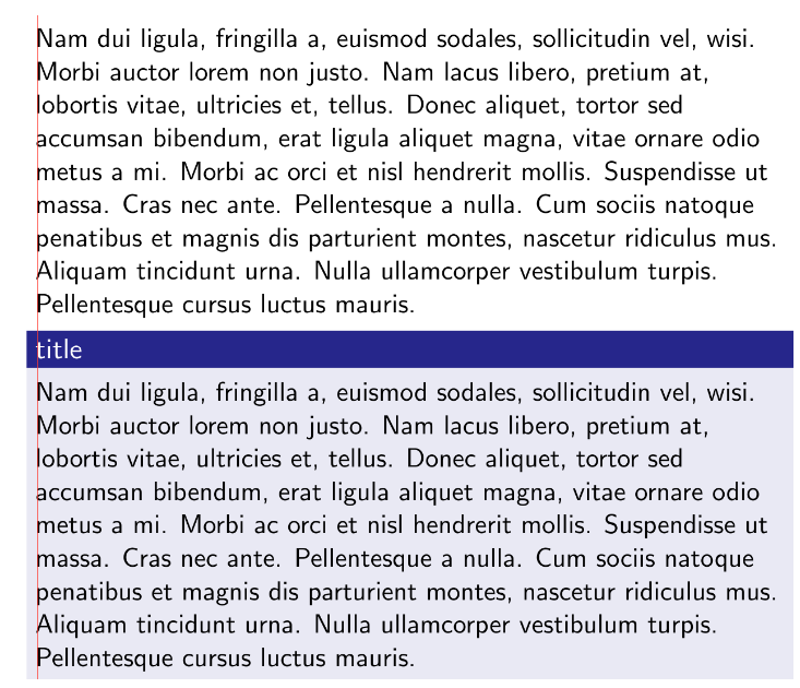
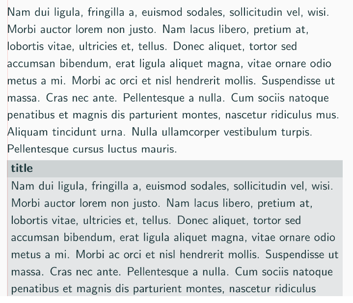
I think the proper choice is the default beamer behavior, especially since this otherwise means that the content inside the blocks look different if you switch to filled blocks. In addition, the spacing for the normal block environments in Metropolis does not work properly, so switching to the default behavior also solves this issue.
Build System
Moloch is part of CTAN and included in TeXLive 2024, so you typically do not need to concern yourself with installing the theme from source. But if you want to do so nonetheless, for instance to enable some new feature or fix from the development version, then Moloch now uses l3build instead of a custom Makefile to handle the build process, which should make life easier for most people, and you simply just need to call these lines:
git clone https://github.com/jolars/moloch.git
cd moloch
l3build install
In addition, it also means that the package now includes unit tests to make sure that nothing in the theme breaks unexpectedly.
Other Miscellaneous Changes
There are several other small changes. I’ve tried to list some of them here below.
Roadmap
I currently don’t foresee any major changes to the theme and will likely upgrade it to a stable state in the near future. So you can count on the theme not to introduce any breaking changes. I think the original Metropolis design is great and I don’t want to stray too far from it.
That being said, one thing that I want to do is to make the colors in the theme easier to customize and perhaps introduce alternative color schemes. That also means bringing back the hi-contrast theme that was in Metropolis but that I removed from Moloch (for reasons that I can’t quite recall now..). In any case, I don’t intend to modify the default choices.
Contributing
If you feel that you can contribute, then please do! The project is on github and you are welcome to raise an issue or start a new discussion if there’s anything you think could be improved.
Acknowledgements
samcarter helped out a lot with discussions and testing of the theme and also helped make transitioning from Metropolis to Moloch smoother. She will actually give a talk on the TUG 2024 meeting in Prague July 19-21 about the theme, so please check it out if you have the chance!
Finally: credit where credit is due. I want to stress that the vast majority of the code in Moloch was written by Matthias Vogelsang, who created the Metropolis package, and that my job has mostly been to patch up its rough spots.